Soon, most of your customers will switch to mobile browsing.
What does that mean?
Tips for creating a mobile website
Unlike traditional browsing, visitors who arrive at mobile sites are highly mature when it comes to purchasing through the site.
For this reason it is recommended to be as precise as possible and provide the exact benefit to the target audiences.
Here is how to do it right -
> Make sure to condense the content, without giving up important features and benefits
> Design the interface simply, and leave complex designed elements to the desktop platform
> Provide as many contact details as possible, but highlight the option to call by phone
> Provide elements that encourage immediate action, such as time- or location-based promotions, special deals and more
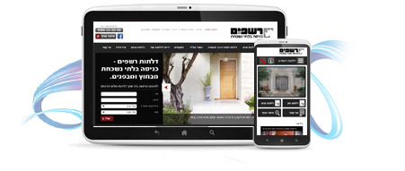
Is your website mobile-friendly?
Soon, most of your customers will switch to mobile browsing.
What does that mean?
A mobile-optimized site that loads quickly and suits handheld navigation will be viewed by visitors who get what they want immediately and respond by buying.
Conversely, a site that delivers a negative browsing experience, an inadequate screen display and failed navigation will suffer high abandonment rates and miss its potential.
Mobile website – why is it important?
With each passing year, the number of visitors using smart devices grows - at work, on the road, in waiting moments and even at home.
Many describe the mobile device as one of the three most significant personal items for them, even more than the television or the computer.
Last year, 53% of smartphone owners used their device to browse various websites and social networks, through which they obtained information, made contact, compared prices, left details and made online purchases.
As a result, many websites are now undergoing an image and technological overhaul, and adapting their virtual interfaces to ones that can be comfortably viewed on mobile.
Mobile-friendly website – how is it done right?
We atAllnet4u create websites that are optimally adapted to the mobile platform.
The system supporting the platform allows entering content, images and videos, is precisely and accessibly designed and allows access from any device.
All the critical elements of the site, including content, contact, navigation bars and more, are adapted and improved on the mobile platform, allowing convenient browsing and instant contact, by means of a button Click to Call that allows calling at the press of a button.
In addition, a button Click to Map shows the location of the business on navigation platforms such as Wase.
Interested in a precise mobile website to increase inquiries and exposure?
Get in touch today with and discover how to do it smartly.

